Superior Natural -
Logo Redesign
Modern refresh of Superior Natural’s logo in preparation for entering Costco.
Skills:
Logo Design
Branding
Illustration
Softwares Used:
Illustrator, Photoshop, Procreate
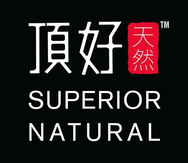
Original Logo
The client requested a modern refresh of its logo in preparation for entering Costco, aiming for a more “global” appeal while emphasizing its organic aesthetic. They also wanted to retain the Chinese brand name—Ding Hao 頂好—from the original logo, ensuring brand recognition among long-standing customers familiar with their tofu products since 1982.


Design Exploration
I experimented with various typography styles for the English words Superior Natural, giving them greater prominence to meet the client’s request for a more global look. The Chinese characters were retained in a vertical arrangement, occupying a smaller portion while preserving brand identity. A hand-drawn red background behind the Chinese text 頂好, carried over from the original logo, was incorporated to honor the brand’s heritage while achieving a balanced composition.
Final Design
I worked with the client through many iterations to arrive at the final logo. They were very pleased and requested for me to redesign additional product packaging, aligning it with the new aesthetic to ensure a cohesive brand image.